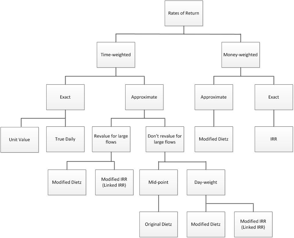
I occasionally describe the formulas we use as a series of bifurcations, starting with time- and money-weighting. And, sometimes I begin with a graphical representation. Well, this morning, I decided to take that graphic to its nth degree, and solicited input from my colleagues, John Simpson and Jed Schneider.
This journey began with the following:
And after a few iterations, it now appears as:
I know … you can’t read it. But, if you click on it you can.
Is it done? No, probably not, but it will be soon. It’s a series of bifurcations (and one or two trifurcations (is that a word?) tossed in), which summarizes the world of rates of return. I think it’s kind of cool … how about you?


